Book Exchange
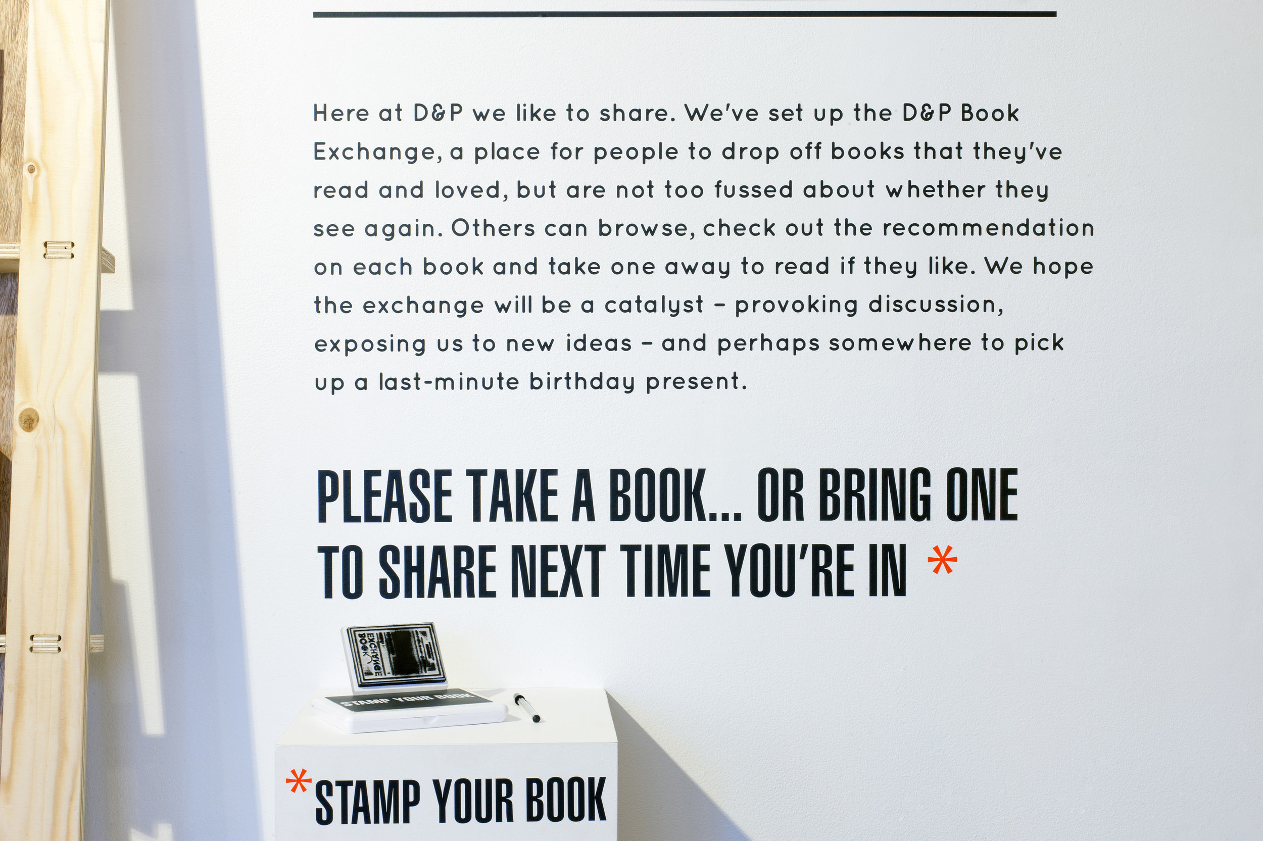
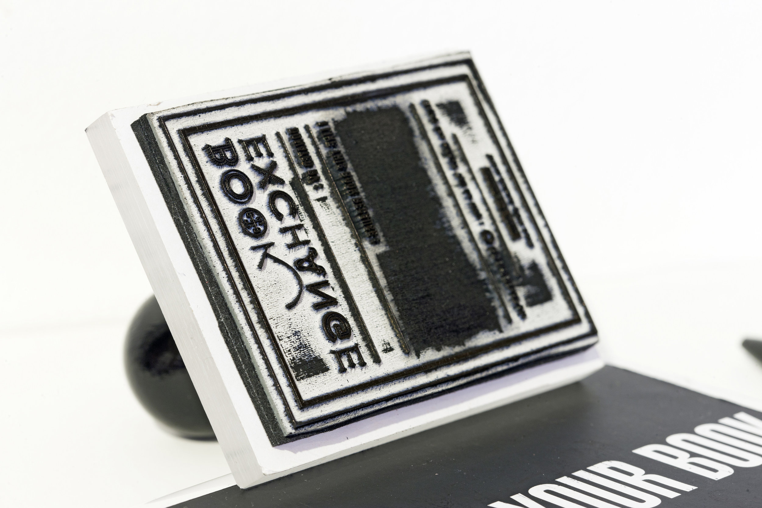
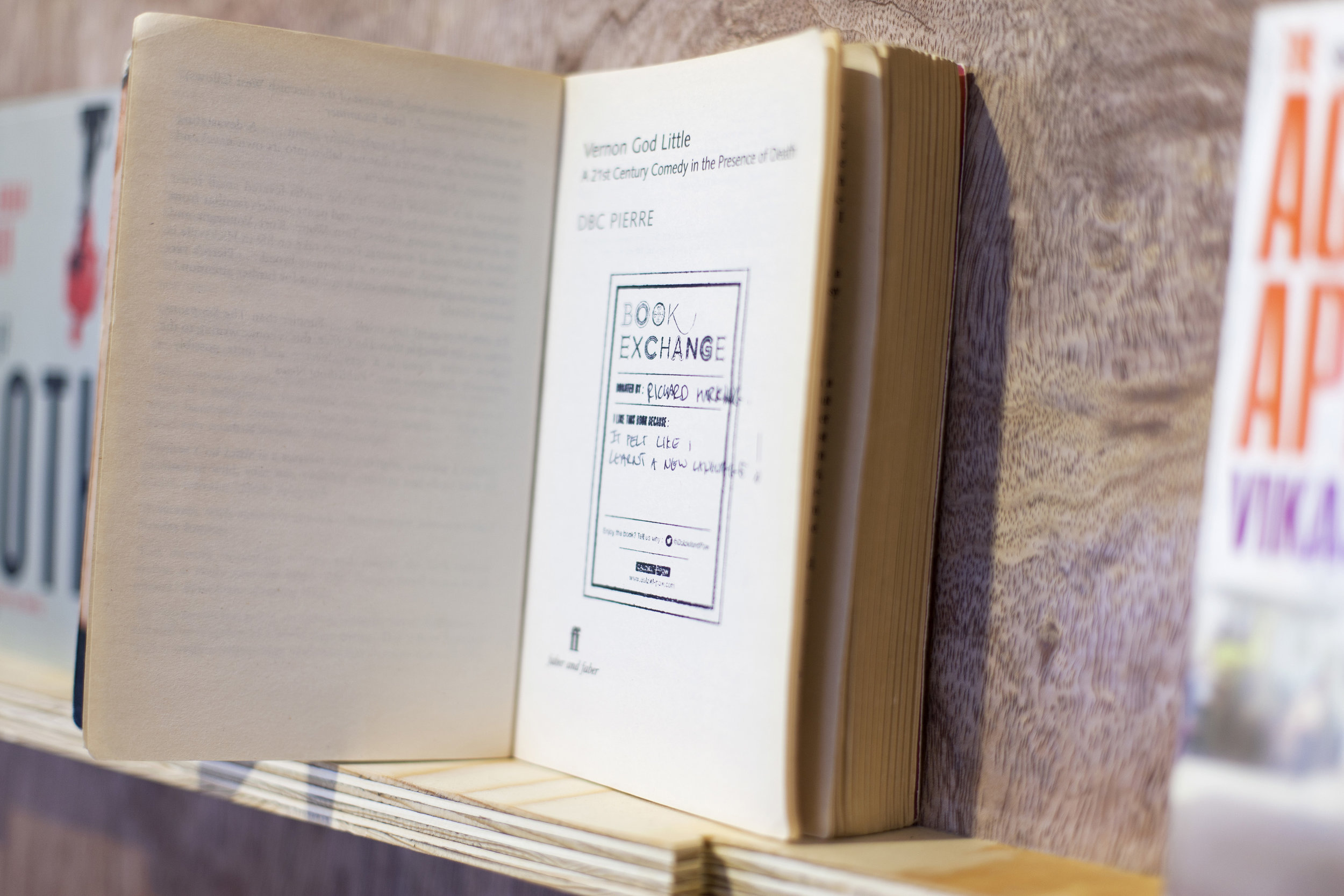
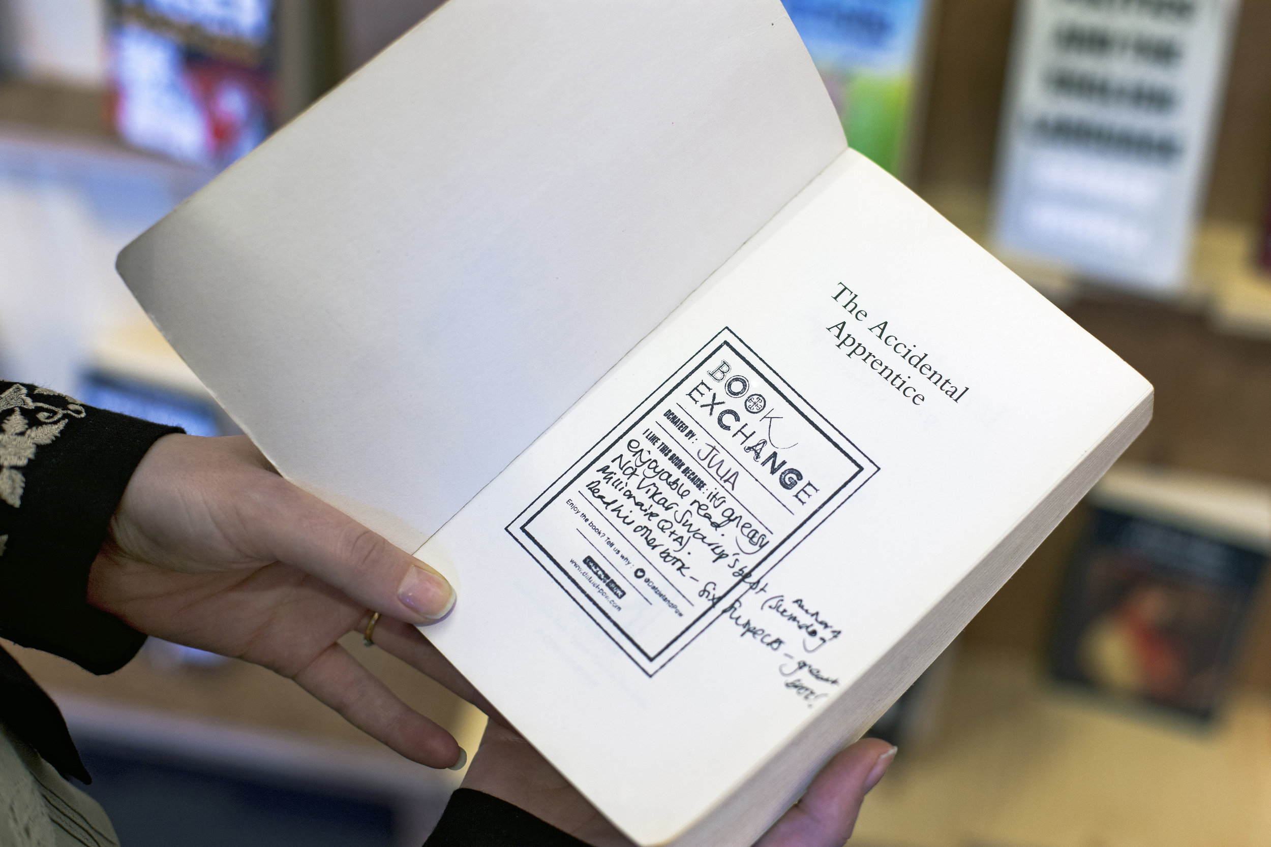
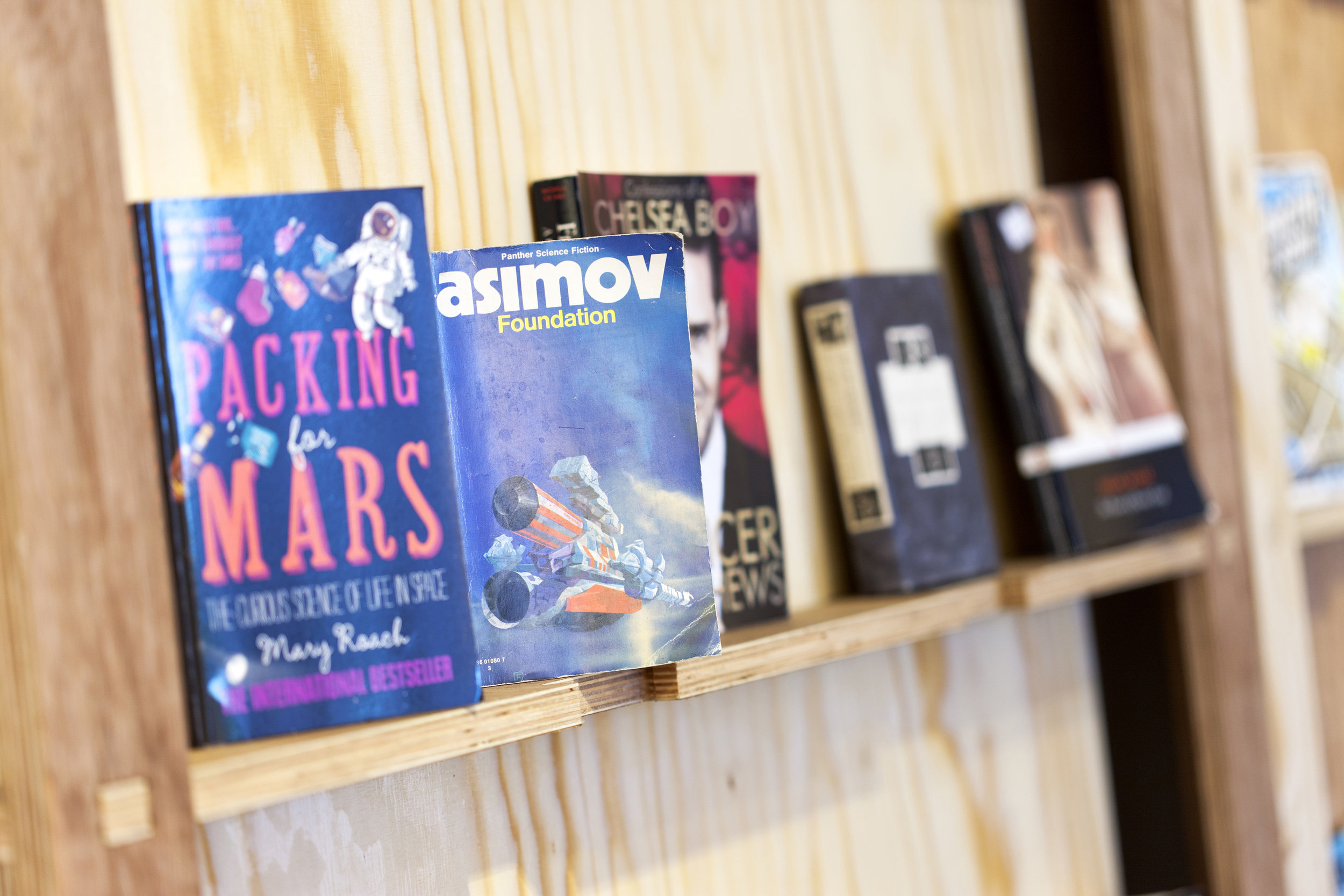
This identity was developed as part of an exhibition display for the reception at Dalziel and Pow, designed to encourage colleagues, clients and visitors to bring a book to exchange for one that they may not have read. The logo itself was based around the concept of every book having a different character and story. The typeface is always the same but with an embellishment that enhances the concept.
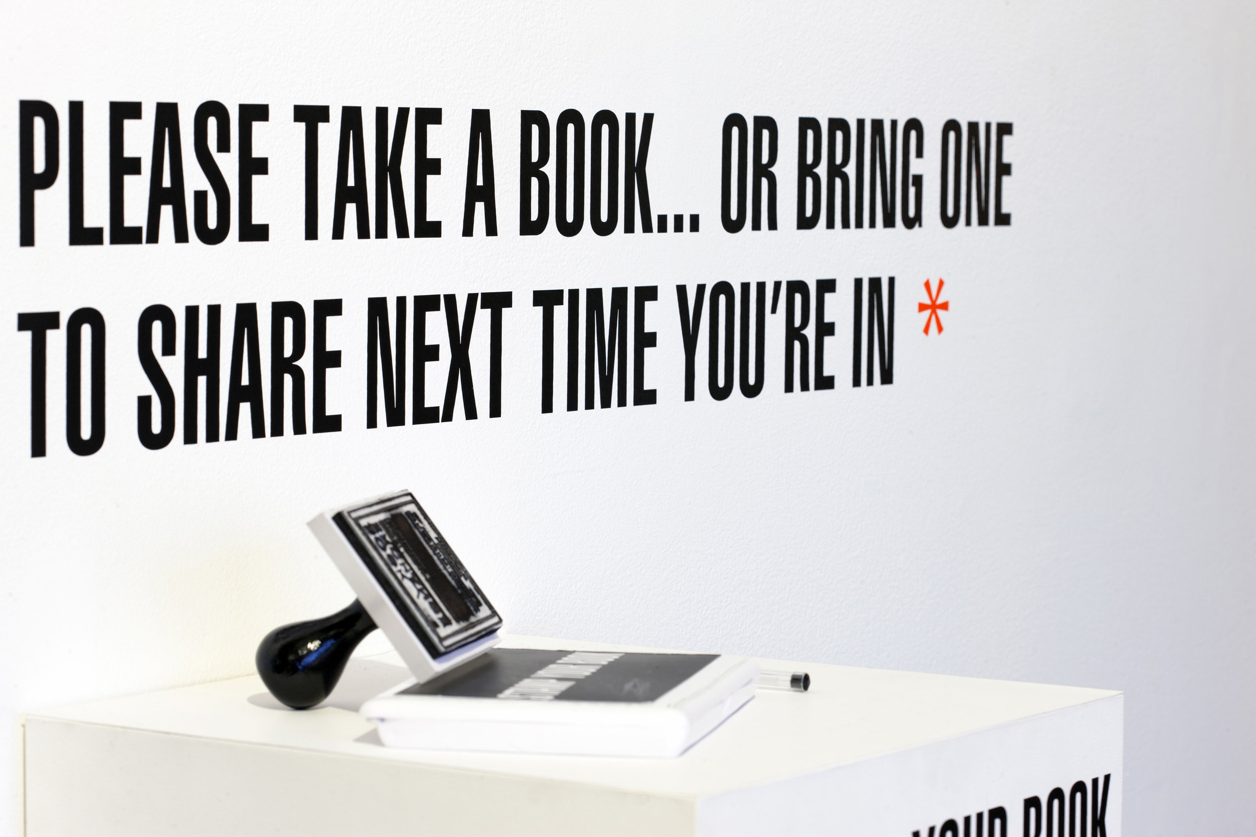
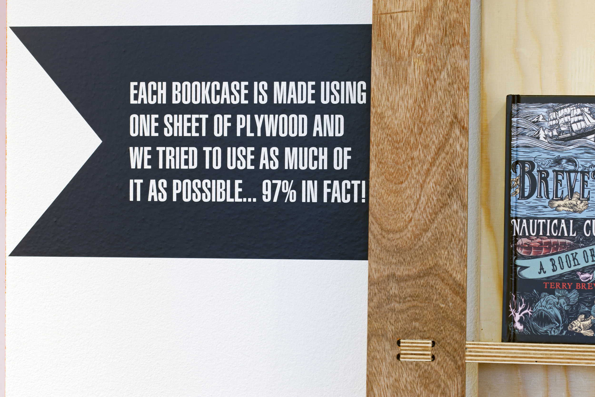
The core feature was a large cut vinyl applied directly to the wall with a series of incidental messages that enable staff and visitors to engage with the installation.
Produced while at Dalziel and Pow - image credit Dalziel and Pow
